WELCOME TO MIDLAND BOOK SHOP!
SHOP FOR
-
Non-ficton
- Non-ficton
-
Contemporary Fiction
- Contemporary Fiction
-
Children
- Children
-
Comics & Graphic Novels
- Comics & Graphic Novels
-
Non-Fiction
- Non-Fiction
-
Fiction
- Fiction
Shop No.20, Aurobindo Palace Market, Hauz Khas, Near Church +91 9818282497 | 011 26867121
110016
New Delhi
IN
Midland The Book Shop ™
Shop No.20, Aurobindo Palace Market, Hauz Khas, Near Church +91 9818282497 | 011 26867121
New Delhi,
IN
+919871604786
https://www.midlandbookshop.com/s/607fe93d7eafcac1f2c73ea4/69591829db7aed90e0608dfb/without-tag-line-480x480.png"
[email protected]
9789383145157
690f3b913b7625814aa346c7
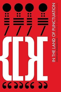
In The Land Of Punctuation (handmade)
https://www.midlandbookshop.com/s/607fe93d7eafcac1f2c73ea4/690f3b923b7625814aa346d4/51wqdvcshrl-_sy385_.jpg
9789383145157
First published in 1905, German poet Christian Morgenstern's Im Reich der Interpunktionen (In the Land of Punctuation) is a comic poem on the flow of language—and the breaks in it. Punctuation signs are markers of pauses, interruptions, asides and stops. But they also point to intonation, intent and emotion... a fact used brilliantly by Morgenstern to turn them into charac-ters with their own agendas, in a drama that careens towards an inevitable end. It is a fun romp, and yet the political undertones are unmistakable, suggesting menacing systems of control. Adding a new dimension to the connection between marks and meaning, graphic designer Rathna Ramanathan illustrates this translated version of the poem with punctuation signs. She evokes older traditions like calligrams and the art of the Russian Constructivists, while developing her own ingenious—and very contemporary—idiom. Her visual grammar balances bold exper-imentation with precise communication, creating an artist's book at the crossroads of language, graphic design and politics. This signed, limited edition book has been silkscreen-printed and bound by hand on recycled handmade paper, at Tara Books' print workshop, run on fair trade practices.
Review
Ramanathan's genius (and there can be no doubting her genius here), is such that In The Land Of Punctuation evokes a complete sense of time and space, it's a world as familiar to us as our own, with characters as obvious to us as any human. And though the story takes over we never escape that what's presented before us is beautiful design at work.-- The Illustrated Forest blog Beautifully designed by Rathna Ramanathan, the images through which the verses develop are all 'assembled' typographically, using only punctuation marks as both independent characters and visual signs forming the elements of the landscape. -- Observatory Mansions blog
About the Author
Christian Morgernstern is a late nineteenth century German poet whose dark and capricious verse was inspired by English Literary nonsense. A satirist of the highest order, his work has continued to delight generations of Germans. Rathna Ramanathan, principle of Minus9 Design, is from Chennai, India and is currently based in London. She holds a phd in the History of Graphic Communication and Typography at the University of Reading and an MA in Communication Design from Central St Martins. Rathna has taught design and typography in India and has taught previously at Central St Martin's London. She is currently Head of Visual Communication at the Royal College of Art, London. She is the Association Typographique Internationale [ATypI] Country Delegate for India. A practising designer, Rathna splits her time between India and the UK and her work for Tara Books has received a number of international design awards. Sirish Rao is a writer interested in children's books and the arts. He lives in Canada and India.
in stock
INR
800
1
1
Email ID already exists!
Your Current password is incorrect
Password Updated Successfully
Thanks for your Feedback
- Home
- Graphic Novels & Manga
- In The Land Of Punctuation (handmade)
In The Land Of Punctuation (handmade)
ISBN:
9789383145157
₹800
₹1,000
(20% OFF)
SIZE GUIDE
Sold By:
Hauz Khas - Aurobindo Market
Details
- ISBN: 9789383145157
- Author: Rathan Ramana Sirish Rao
- Publisher: Tara Books
- Pages: 32
- Format: Hardback
Book Description
First published in 1905, German poet Christian Morgenstern's Im Reich der Interpunktionen (In the Land of Punctuation) is a comic poem on the flow of language—and the breaks in it. Punctuation signs are markers of pauses, interruptions, asides and stops. But they also point to intonation, intent and emotion... a fact used brilliantly by Morgenstern to turn them into charac-ters with their own agendas, in a drama that careens towards an inevitable end. It is a fun romp, and yet the political undertones are unmistakable, suggesting menacing systems of control. Adding a new dimension to the connection between marks and meaning, graphic designer Rathna Ramanathan illustrates this translated version of the poem with punctuation signs. She evokes older traditions like calligrams and the art of the Russian Constructivists, while developing her own ingenious—and very contemporary—idiom. Her visual grammar balances bold exper-imentation with precise communication, creating an artist's book at the crossroads of language, graphic design and politics. This signed, limited edition book has been silkscreen-printed and bound by hand on recycled handmade paper, at Tara Books' print workshop, run on fair trade practices.
Review
Ramanathan's genius (and there can be no doubting her genius here), is such that In The Land Of Punctuation evokes a complete sense of time and space, it's a world as familiar to us as our own, with characters as obvious to us as any human. And though the story takes over we never escape that what's presented before us is beautiful design at work.-- The Illustrated Forest blog Beautifully designed by Rathna Ramanathan, the images through which the verses develop are all 'assembled' typographically, using only punctuation marks as both independent characters and visual signs forming the elements of the landscape. -- Observatory Mansions blog
About the Author
Christian Morgernstern is a late nineteenth century German poet whose dark and capricious verse was inspired by English Literary nonsense. A satirist of the highest order, his work has continued to delight generations of Germans. Rathna Ramanathan, principle of Minus9 Design, is from Chennai, India and is currently based in London. She holds a phd in the History of Graphic Communication and Typography at the University of Reading and an MA in Communication Design from Central St Martins. Rathna has taught design and typography in India and has taught previously at Central St Martin's London. She is currently Head of Visual Communication at the Royal College of Art, London. She is the Association Typographique Internationale [ATypI] Country Delegate for India. A practising designer, Rathna splits her time between India and the UK and her work for Tara Books has received a number of international design awards. Sirish Rao is a writer interested in children's books and the arts. He lives in Canada and India.
Related Books
User reviews
NEWSLETTER
Subscribe to get Email Updates!
Thanks for subscribing.
Your response has been recorded.

India's Iconic & Independent Book Store offering a vast selection of books across a variety of genres Since 1978.
"We Believe In The Power of Books" Our mission is to make books accessible to everyone, and to cultivate a culture of reading and learning. We strive to provide a wide range of books, from classic literature, sci-fi and fantasy, to graphic novels, biographies and self-help books, so that everyone can find something to read.
Whether you’re looking for your next great read, a gift for someone special, or just browsing, Midland is here to make your book-buying experience easy and enjoyable.
We are shipping pan India and across the world.
For Bulk Order / Corporate Gifting
 +91 9818282497 |
  [email protected]
Click To Know More
INFORMATION
POLICIES
ACCOUNT
QUICK LINKS
ADDRESS
Midland Book Shop - Hauz Khas
Shop No.20, Aurobindo Palace Market, Near Church, New Delhi
Shop No.20, Aurobindo Palace Market, Near Church, New Delhi

